Thursday 11 December 2014

Masthead Designing


After doing a range of ideas for my front cover, I have chosen to test a range of colours for my masthead in order to try and make it stand out more on the front cover. I found that when I had everything on the front cover the masthead did not stand out as much as some of the graphics and features that are included in the magazine.


 I have tested the different coloured mastheads on one of my composition ideas to see howw it fits in with the colour scheme. The blue is to dark and doesn't stand out against the background. The green also doesn't go well on the front cover because it is a completly different colour and doesnt fit in with the rest of the colours, however a positive of the green is that it stands out really well against the background. The rest of the colours go quite well with the magazine because they fit in with the colour scheme.

Friday 5 December 2014

Final Design Ideas

 This is my original design with nothing changed to it. This design is quite simple and has a lot of colour.


On this design I have changed the writing around the person cut out " Jessica Laurens"


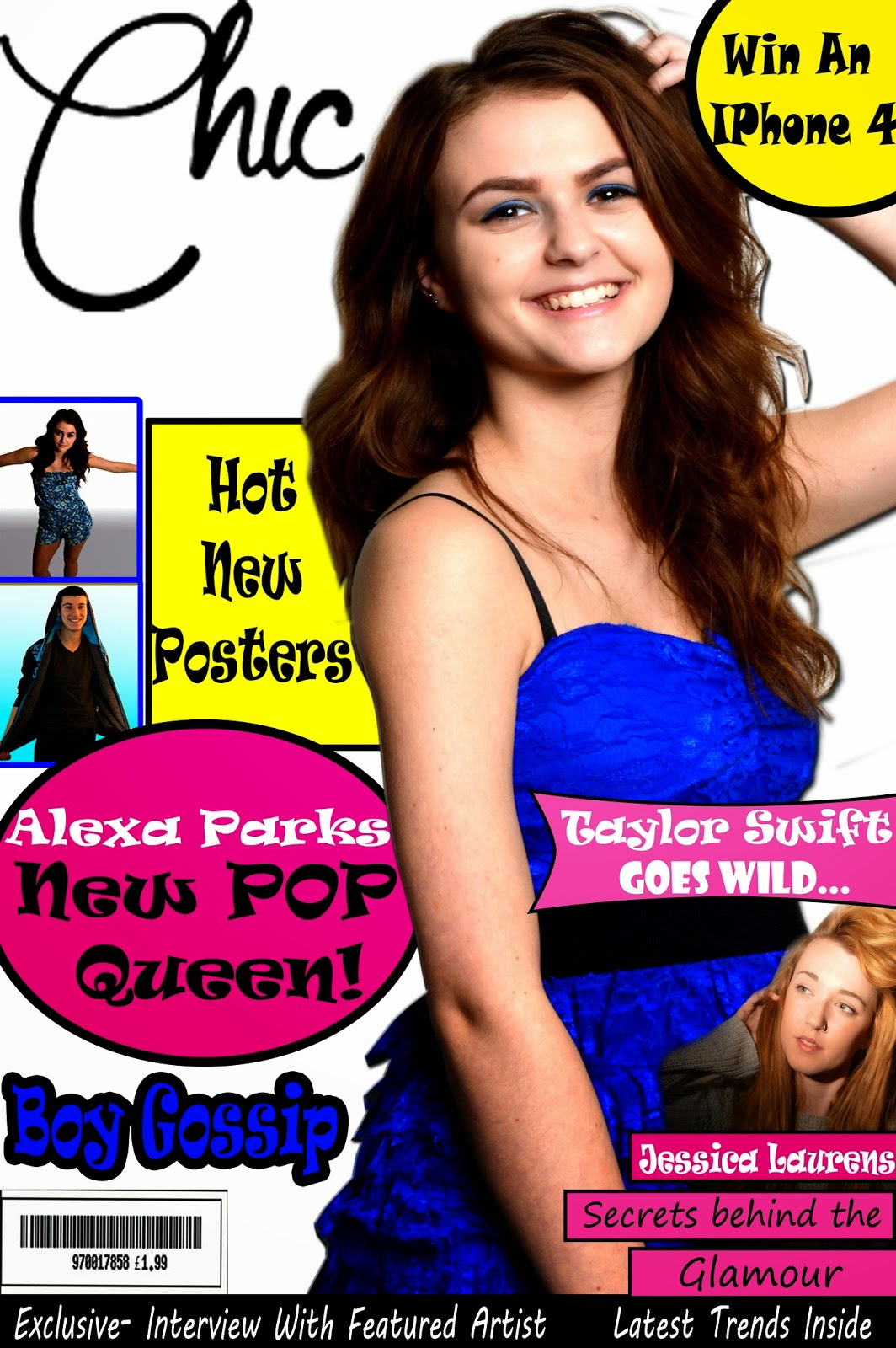
 On this design I have changed the way that the smaller features are shown on the page, I have placed the text around the person instead of having it going across her body and I have moved the Taylor Swift smaller feature below it.

 On this one I have kept the layout of the previous one however I have changed the colour of the graphics to red.
On this one I have used the previous design with the red and then I have placed a pink pokadot theme on the background.