
Saturday, 13 December 2014

Friday, 12 December 2014


Thursday, 11 December 2014
Masthead Designing

After doing a range of ideas for my front cover, I have chosen to test a range of colours for my masthead in order to try and make it stand out more on the front cover. I found that when I had everything on the front cover the masthead did not stand out as much as some of the graphics and features that are included in the magazine.

Friday, 5 December 2014
Final Design Ideas
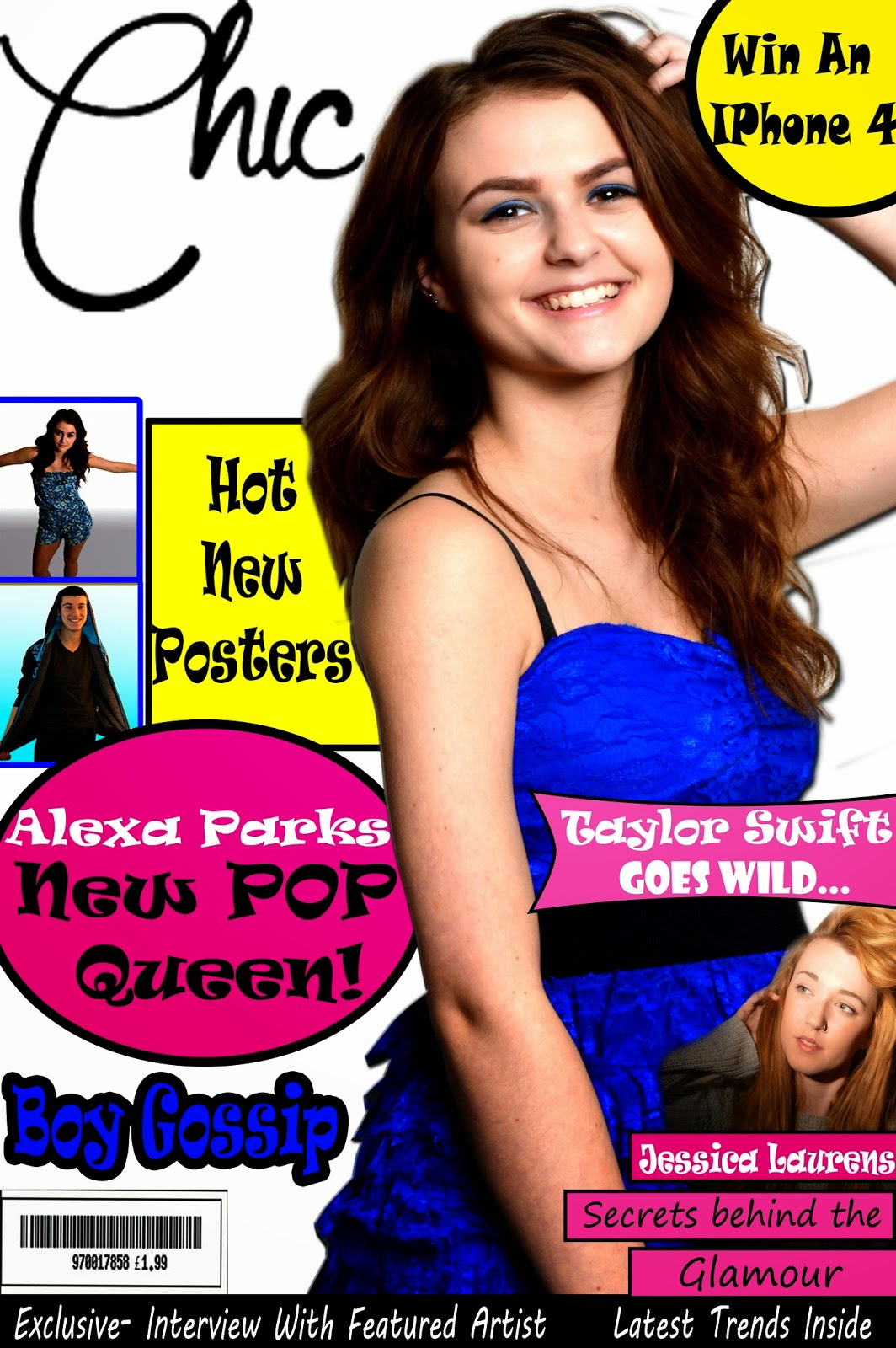


On this design I have changed the way that the smaller features are shown on the page, I have placed the text around the person instead of having it going across her body and I have moved the Taylor Swift smaller feature below it.


Thursday, 27 November 2014
Composition Ideas
 This is my first compsition idea
 + It includes more than one image
+ The image covers the whole of the magazine
+ Text stands out against graphics
+ Images are excellent quality
+ relevant to the genre
- Font's need changing
- Bolder colours
- To much like a poster
- Poster images are to big
- Not using space effectively

+got a lot more going on
+more colour
+Stands out a bit more than the first idea
+ has more images
+ text is bolder
- the background overpowers the image
- some of the colours do not match
- to many colours not sticking to a basic colour scheme


Magazine Main Image Ideas


These are 3 front cover ideas to begin with, I posted a post on FB to ask which one works best for a Pop magazine cover. The people who replied said that they liked the above photo better. With the blue dress and pink background.


Subscribe to:
Posts (Atom)