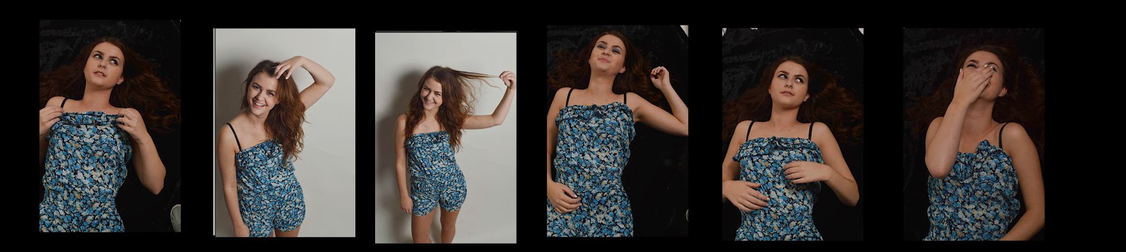
This is my first compsition idea
 + It includes more than one image
+ The image covers the whole of the magazine
+ Text stands out against graphics
+ Images are excellent quality
+ relevant to the genre
- Font's need changing
- Bolder colours
- To much like a poster
- Poster images are to big
- Not using space effectively

+got a lot more going on
+more colour
+Stands out a bit more than the first idea
+ has more images
+ text is bolder
- the background overpowers the image
- some of the colours do not match
- to many colours not sticking to a basic colour scheme