When making my college magazine I looked at the conventions of a college magazine and applied them to the best of my knowledge in order to create my own college magazine however I now know that I could have improved greatly on this and made it so much better than it was from looking at my final music magazine and how far I have come.
 - Masthead- the masthead on my college magazine doesn't stand out at all and is quite hard to see, after doing my research for my music magazine I found out what colours are commonly used for a masthead in order to make it stand out more from the background and appeal better to the audience. Even both fonts are quite feminine the music magazine stands out better as it is a solid colour.
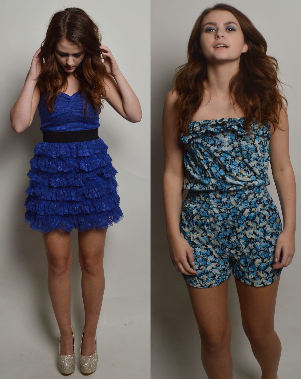
- Main Image- I have found that the main image needs to be interesting and to appeal to an audience, on my college magazine my figure is just sitting down looking at the camera this is quite boring as she is not doing much, I have learnt from this and in my music magazine my figure is playing with her hair and looks like she is having a bit of fun. They are both taken with the same high quality camera therefore they are decent in quality however the editing of my college magazine image could have being done better.
- Main Headline- the main headline needs to be eye catching and make the reader want to find out more therefore they buy the magazine. "New Start, New Students" now looking at it I think is quite boring and it doesn't really attract the reader into wanting to know more. The whole of the line of text is in a straight line and is quite boring. However I have improved this on my music magazine by making the headline something big "Alexa Parcs, New Pop Queen!". This makes the reader want to find out more as they want to know all about this new pop queen that's suddenly on the scene. The text is big and bold therefore catching the readers attention as well as it being slightly sloped to add a bit of fun to the text.
- Graphics- I think that the use of graphics is very important on a magazine as it makes certain parts of the magazine stand out more against the background. On my college magazine I did not use any graphics in order to highlight any of my smaller features. I only used one graphic as the footer to my magazine. I changed this in my music magazine when I used graphics to highlight parts of the text and images in order to make them stand out more. I think that this was very effective as not only does it add more colour to the page it makes it look more fun and interesting to read.
- Background- For my college magazine I have kept the background the same as it was in the original image all I have done is gotten rid of the colour in order to dim it down a bit so that I could place features on top without them getting lost within the image. When researching for my music magazine I found that most backgrounds used were white and were filled up with colour of graphics and wording. I personally think that this looks so much better and more professional.
- Footer- Both of my magazines both have a footer in order to get more people to read the magazine however on the college magazine I offered to win tickets this could have being put in a graphic on the page somewhere else to grab the readers attention better. On the music magazine I have put what is featured within the magazine along the footer so that people know what to expect when they look inside.
- Smaller Images/ Features- I had very limited smaller images and features on the college magazine therefore the front page was quite boring and bland. I learnt from this and for my music magazine I made it bigger and better by adding in more images and more text to fill up the space more effectively.
- Layout- For my layout of my college magazine it is very basic and plain. The model is centre of the page with a couple of smaller features surrounding her. It is a medium close up just looking directly at the camera. For the music magazine the layout had to be more fun and exciting. Even though my main image is the main focus of the page it is positioned just right of the page and takes up a lot more room, the rest of the gaps have being filled with colour and graphics in order to make it more interesting.
Mise En Scene
- Costume- For my college magazine the costume was quite simple as it was about college students therefore just normal everyday clothing was appropriate for this magazine, it didn't need anything to fancy. However when it came to my music magazine I had to think more carefully about the costume and what my figure would be wearing. I looked at a variety of different clothing as seen in question one of my evaluation and chose the appropriate clothing for my model to wear.
- Make Up- In the college magazine the make up is very natural and is not over done, however when shooting the images for my music magazine I chose make up that suited the clothing that my model was wearing and also chose tones that suited her skin tone. The make up need to be a lot brighter as the purpose of the magazine has changed and it is aimed at a different kind of audience.
- Setting/ Location- The location of my college magazine was set in a college environment in a courtyard where you can see the college in the background I think that this suits the purpose of the magazine however it also feels quite boring. The location of my music magazine was in a photography studio with the correct kind of lighting and white backdrop, this therefore made it easier to cut my model out of the background if needed.