The audience that I was aiming for was female middle class between the ages of 16 to 19. However from asking a few questions in the video above I have realised that it could be aimed at a younger audience.
Friday, 20 March 2015
Evaluation Question Four
Who would be the audience for your media product?
The audience that I was aiming for was female middle class between the ages of 16 to 19. However from asking a few questions in the video above I have realised that it could be aimed at a younger audience.
The audience that I was aiming for was female middle class between the ages of 16 to 19. However from asking a few questions in the video above I have realised that it could be aimed at a younger audience.

Evaluation Question Three
What kind of media institution might distribute your media product and why?


Even though they already publish a magazine for pop music, mine is aimed at a slightly different audience therefore it wouldn't be competing much with the other magazine "top of the pops". I think that this would be perfect for distributing my product as it is a very well established company that has many dedicated readers.


This is what my app would look like when it has been opened. It would contain a range of different sections that people may be interested in. The gossip would contain extra gossip that hasn't being included in the magazine issue that was just released. However this app doesn't replace the magazine, if people would rather read the magazine off the app when they click on the latest issue it will come up with a small sneak preview or to buy the magazine to view on the app at the cost of £1.99.
The subscribe button allows the reader/ user to subscribe to the magazine to receive offers and discounts on the magazine.
As I found out from my audience data research people like to read about music once a week at most, therefore I think that it would be beneficial to have an app for my readers to gain quick access to the magazine content without giving to much away of what's in the magazine. It would include games and quizes and advice on quite a few topics.
This is what my app would look like when it has been opened. It would contain a range of different sections that people may be interested in. The gossip would contain extra gossip that hasn't being included in the magazine issue that was just released. However this app doesn't replace the magazine, if people would rather read the magazine off the app when they click on the latest issue it will come up with a small sneak preview or to buy the magazine to view on the app at the cost of £1.99.
The subscribe button allows the reader/ user to subscribe to the magazine to receive offers and discounts on the magazine.
As I found out from my audience data research people like to read about music once a week at most, therefore I think that it would be beneficial to have an app for my readers to gain quick access to the magazine content without giving to much away of what's in the magazine. It would include games and quizes and advice on quite a few topics.
Evaluation Question Two
How does your media product represent particular social groups?

When doing my research I found out which artists from the Pop music industry people liked. I used this research in order to gain inspiration for my magazine. I have mainly looked at female artists as the artist that features in my magazine is female. I have looked at style of dress, makeup, body positioning's and location when they are featured on a magazine. Most magazines tend to have photo shoots in a studio and therefore keep the white background as they fill the rest of the space with colourful graphics. I found doing this questionnaire helpful because it meant that I could find out what the audience liked and how I could merge my idea around the ideal view of what people will buy.
Costume

I have looked at a range of celebrity's styles mostly looking at dresses and play-suits as these are the two items of clothing that I chose for my main model to wear in the magazine. The reoccurring colours in these images are pink and blue. The pattern is floral and layered ruffles of material. I think that these patterns and colours are quite feminine therefore they appeal to a female audience. I liked the different styles of clothing and necklines. the sweetheart neckline looks really flattering as well as the straight cut of the jumpsuit.

When picking my costumes I looked at a range of clothing that was a possibility for my model to wear, the long prom dress appears in the magazine on the contents page for one of the smaller features of the magazine. I thought that the blue lace dress and the blue jumpsuit suited my main model better as it complements her skin tone.
My Costume
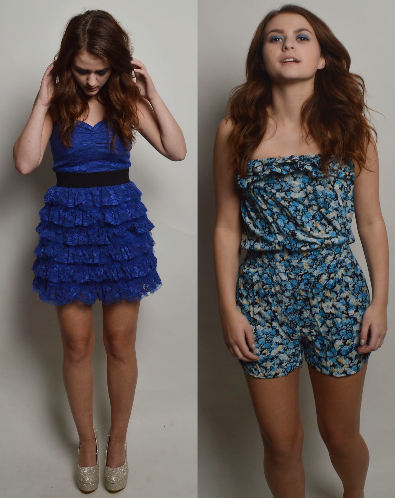 For my costume I have chosen youthfully feminine clothing. I have chosen two different
outfits for my main model to vary the photographs within the magazine. The
first piece of clothing is the blue dress with the black waist band. I chose
this dress because the lace fabric and the layers adds a feminine touch to the
dress, the colour blue challenges the conventions of pop because
the colours usually associated with this genre of music is
bright and colourful colours for example pink is hugely used. The other
item of clothing that I had chosen is the floral playsuit in blue. Again this
is quite feminine and fun. I think that the floral pattern makes the image feel
summery therefore portraying a happy mood to the audience as summer is associated
with being outside in the sun having fun. The shoes that I chose my model to
wear were glittery silver heels from Primark. I think that the shoes add to the
image and make it more glamorous to the audience. The clothing and shoes
is trying to represent the current generation and the latest fashion styles
that are worn.
For my costume I have chosen youthfully feminine clothing. I have chosen two different
outfits for my main model to vary the photographs within the magazine. The
first piece of clothing is the blue dress with the black waist band. I chose
this dress because the lace fabric and the layers adds a feminine touch to the
dress, the colour blue challenges the conventions of pop because
the colours usually associated with this genre of music is
bright and colourful colours for example pink is hugely used. The other
item of clothing that I had chosen is the floral playsuit in blue. Again this
is quite feminine and fun. I think that the floral pattern makes the image feel
summery therefore portraying a happy mood to the audience as summer is associated
with being outside in the sun having fun. The shoes that I chose my model to
wear were glittery silver heels from Primark. I think that the shoes add to the
image and make it more glamorous to the audience. The clothing and shoes
is trying to represent the current generation and the latest fashion styles
that are worn.

When selecting the shoes for my model I had a range of different pairs to choose from that would have fit well with the model. They are different styles therefore they could have changed the way that the outfit looked. For example the black boots with the dress could have still looked nice but they would have being a bit to plain and boring. Personally I think that the glittery platform heels suit the style of my artist better due to it adding a bit more glam to the image.

Body Positioning
I have looked at a range of positions, these are a few examples that I have used in my work. I have mainly looked at Katy Perry and Pixie Lott for my main artist that is featured in this magazine.
When doing my research I found out which artists from the Pop music industry people liked. I used this research in order to gain inspiration for my magazine. I have mainly looked at female artists as the artist that features in my magazine is female. I have looked at style of dress, makeup, body positioning's and location when they are featured on a magazine. Most magazines tend to have photo shoots in a studio and therefore keep the white background as they fill the rest of the space with colourful graphics. I found doing this questionnaire helpful because it meant that I could find out what the audience liked and how I could merge my idea around the ideal view of what people will buy.
Costume
I have looked at a range of celebrity's styles mostly looking at dresses and play-suits as these are the two items of clothing that I chose for my main model to wear in the magazine. The reoccurring colours in these images are pink and blue. The pattern is floral and layered ruffles of material. I think that these patterns and colours are quite feminine therefore they appeal to a female audience. I liked the different styles of clothing and necklines. the sweetheart neckline looks really flattering as well as the straight cut of the jumpsuit.
My Costume
When selecting the shoes for my model I had a range of different pairs to choose from that would have fit well with the model. They are different styles therefore they could have changed the way that the outfit looked. For example the black boots with the dress could have still looked nice but they would have being a bit to plain and boring. Personally I think that the glittery platform heels suit the style of my artist better due to it adding a bit more glam to the image.
Body Positioning
I have looked at a range of positions, these are a few examples that I have used in my work. I have mainly looked at Katy Perry and Pixie Lott for my main artist that is featured in this magazine.
Friday, 27 February 2015
Evaluation Question One
In what way does your media product use, develop or challenge forms and conventions of a real media products?
My front cover has being designed in order to fit the conventional pop music magazine front cover. I will compare this to an existing front cover that is already very popular in music magazines aimed towards a younger audience.


Friday, 13 February 2015
Double Page Spread Ideas

In this double page spread I have made the figure bigger and changed the way that the text is presented. Even though the background is quite plain I think that it looks good because the text adds the colour to the page.

I have changed the quotes that I have included in my article instead of having the love hearts to show the quotes I have taken a quote out the text and made it size 11 and in bold. I don't really like this one because it takes away a bit of the colour away from the page.

In this layout I have added a pink gradient to the background behind the figure and moved the main image to the other side. I have wrapped the text around the figures hand and spaced it out across the page.
 I have kept everything else the same and changed the background to white to see if it looked any better with a simple colour.
 I have gone for a more colourful background using both of my main colours as the background. I think that this looks okay but its really in your face bright.
Friday, 6 February 2015
Double Page Spread Idea

Testing Different Ideas
I will use black body text for the main part of the article.

This is using blue writing for the question text and blue hearts, this sticks to the colour theme with the blue and pink however it doesn't stand out very well as blue can connote sadness and not a happy article about a new artist.

Next I tried pink hearts with blue writing for the article, Even though it does stick to the colour theme I don't think that it works very well.

Finally I have gone for pink writing and pink hearts. I think that this suits the article a lot better.
Subscribe to:
Posts (Atom)