Thursday 25 September 2014

Evaluation

What have you learnt from completing this task?
I have learnt in this project how to deconstruct an image and analyse it using LIIAR. I can now write about an image and the meaning behind certain parts of an image for example using the colour red and the connotations of red like love, blood etc. I have developed skills in media studies learning the key words and definitions that I did not know before. This will help me in future projects when analysing images. I have developed my skills in Photoshop editing images more professionally than before. I have had previous experience with Photoshop however my skills have developed in learning different techniques and ways of working. I have learnt how to properly cut out an image from a background which has a fuzzy outline like hair using the feather tool so that it doesn’t have a flat edge and look really badly Photoshopped.  I have learnt how to time manage and work to deadlines making sure that I have everything done and to my best ability before submitting my work. I have learnt to work to a specific brief and follow every part of what I needed to include in my magazine. I couldn’t go off on my own and be creative I had to make a college magazine and it had to include certain features like a medium close up. I couldn’t use a long shot or close up because it wouldn’t not be convenient for the magazine. I have also learnt how to use a Mac efficiently and work all the features including Photoshop; this means that I have widened my technological knowledge. This will be helpful for later projects if I ever need to use a Mac. All together I have only learnt a few new things from scratch, most of what I have done for this project is just developing what I already know.
 

How have you used technology?
The camera that I have used for my project was a Nikon 3200 DSLR, I chose to use this camera because it is very high quality and creates very excellent quality images. This would be better than using a normal camera on your phone as there is more detail and resolution is better than an everyday camera. I also varied the computer software that I have used during this project. I have used a PC before therefore I found it easy to use and very straight forward however I also used a Mac before which I had never used before, to begin with I found it very difficult to work out how to use, with the help of another student I developed my knowledge and learned how to use a Mac. Now I know how to use programs such as Photoshop and Safari effectively. I have used the old Photoshop CS5 and the new Photoshop CS6. This is because the computers have different versions installed in them. As I have used Photoshop before I found it very easy to use compared to other people in my class. I have helped others when stuck using Photoshop as well. Even though I have used it before I have learnt new techniques and ways of working in Photoshop.  

What convention have you used and why? 
Masthead- I have used a masthead because you need a name for the magazine, if you didn't the magazine would be unrecognisable and people wouldn't know what they are buying. The masthead sums up the magazine and what it is going to be about. People reading this magazine would know that this magazine would be about college and studying.
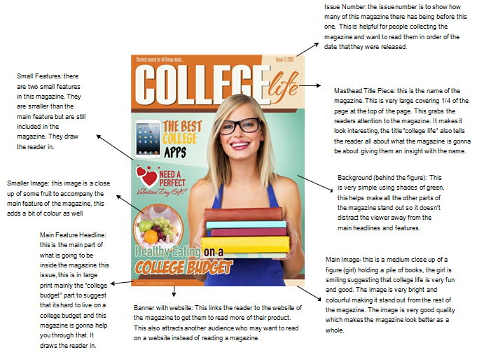
Main Image- Medium close up, this was compulusary to have as part of the magazine. This is a medium close up of a figure looking directly at the camera, this portrays that she is looking directly at you as a viewer inviting you to buy the magazine.
Image (IPhone)- I have used this image to advertise the IPhone and add more images to make the cover look more interesting than just one image and text.
Small Features- I have included small features to show what would be featured inside the magazine this is so that people know what they are buying. If nothing what is featured in the magazine doesn't interest them there is no point in them buying the magazine.
Main Feature- this is the main story of the magazine. This is usually at the beggining of the magazine and normally takes up a double page spread. This is what pulls the readers in and makes them interested in the magazine.
Offers/ Adverts Banner- this promotes the magazine and what offers you can get when you buy the magazine, for example in my magazine above you can win tickets to any concert of your choice, this is good for music lovers and may interest them in the magazine.
Issue Number- this is to show the reader what magazine it is, for my magazine it is the first issue.
Date- this is to show what date it was published this is good for people collecting the magazine so they know what order they came in.
Barcode- this is to scan when they buy the magazine.
Price- this is for the customer so that they know how much the product will cost.
Sub Masthead- this explains the masthead furthur by saying what kind of magazine it is.
 
What would you change if you were to do this task again?
If I was to do this task again I would change the font and colour of the main masthead stand out more against the background to make it more recognisable when it's seen. I would also spend more time editing my final front cover to make it perfect and that the figure has no black and white on her at all, although this is not noticeable from a distance it is noticeable when looked at closely. I would also change the headlines to something that might interest the students more; I would enhance them even more by giving them a background to make them pop out from the page so that the viewer won’t be struggling to read the headlines. I would also change the speed that I do my work, I realised that I was working to slowly and running out of time this led me to spending a lot of study periods and lunches to try and catch up, I would solve this by setting different days for different tasks and attempt to stick to these deadlines that I have set myself. If I was to do this task again I would think of a more creative photograph for my front cover, I would take multiple shoots to have a wider selection of photographs to select from. This would be better because then I could create a more interesting magazine that might appeal to a set type of students like a person doing chemistry would apply to chemistry students and interest them in the magazine. I would also make sure that my contents page colours match up to the colours on the magazine cover this would make it more consist and professional keeping the same colour scheme. Finally the last thing that I would change is how I took the shoots, for my shoot I did not have many ideas so I chose random positioning on the spot. In the future I know that when I go to do a shoot I will research different types of positioning so that I have them in the back of my head so the shoot will be more straight forward.

Final Contents Page


Tuesday 23 September 2014

Photoshop Steps To Final Front Cover


Step One: First I opened up Photoshop and opened image DSC_0060. This is the main image that I am going to use as my medium close up front cover, I have chosen this image because it has great lighting and the background has already being slightly blurred by the camera to make the figure stand out better.


Next I have used the burn tool to make the floor a bit darker around the figure to give a bit of shadow behind her.


Then I adjusted the levels to make the image darker in some parts and lighter in others this makes the image look better in quality and makes it stand out.  


Brightness: -70
Contrast: -24


Exposure: -0.58
Offset: -0.0026
Gamma Correction: 1.37


Saturation: +16
Vibrance: +63


Then I used the black and white tool to make the whole image black and white next I used the eraser to get rid of the black and white on the figure to make the figure colourful again. I like this because it tones down the background a bit more so its not in your face.


"SOS STUDY"
Font: Lucida Calligraphy then I added a purple stroke outline and an inner white glow this created this really nice header.
Size 170


"A WYKE College Magazine"
Font:  Modern NO 22
Size: 24 
Colour: White


Added a purple banner same colour as the masthead outline
Opacity- 87% so you can still see a small bit of background behind it.


Next I took an image of my Iphone and added it into the magazine cover as one of my smaller features about Iphones. I added a black rectangle to get rid of the reflection in the screen.


"Is Apple Bigger Than Ever" text
Size- 45
Colour- Red
Font- Modern No 20
Effect- Outer glow


"Halloween Party Of The Year!" text
Size- 36
Colour- White with green outer glow
Font- Modern No 20


"Free lunch pass with every purchase of a termly bus pass" text
Size- 18
Colour- White
Font- Lucida Sans Typewriter


"Win tickets to any concert of your choice" text
Size- 24
Colour  White
Font- Lucida Sans Typewriter


Barcode and price
Made it using a website
http://www.barcodesinc.com/generator/index.php


"Issue Number 01, 23rd September 2014"
Size- 14
Colour - white
Font- Modern No 20


"New Start, New Students"
Size- 169
Colour- white with purple stroke outline
Font- Modern No 20


Photoshop Steps To Contents Page

To begin with I edited one of the images that would be on my contents page. As you can see in the layers bar, I have adjusted the levels to make the image darker, after I applied a black & white layer. Using the eraser I rubbed out the black & white overlay from the figure and book case to make them stand out better. Finally for this image I adjusted the brightness and contrast so that the image wasn't dark.
 
Next I edited the second image for the contents page, first I created a black background to give it a border, then I adjusted the levels to make the image darker as it was to bright. After I adjusted the exposure to make it more exposed and slightly brighter in some places. Then I added a gradient using the eraser tool I rubbed away the gradient layer from the figure. It gives the figure a nice outline/ shadow. Finally I added a black and white layer to vary the amount of colour that I have on my contents page.
 
Finally I made the final contents page. I made a new canvas A4,  next I painted a purple background lowering the opacity to make it lighter insted of a solid colour. Then I used the white brush again lowering the opacity to that it blends into the purple background. I think that the messy look, looks quite good and effective because its not trying to hard to be perfect. Then I added on my two images making them smaller to fit onto the page. I added a black border around the top image as I did not do this on the orginal image. Then I added all the page numbers. Finally on a different layer I added all the contents text of the magazine onto the page. Making sure that I included everything from my front cover.

Draft Contents Page

Page 2- New students, New start
Page 6- Whats new?
Page 8- Study Tips
Page 10- Is the new IPhone better?
Page 14- Newest Fashion trends
Page 16- Welcome to Wyke from teachers
Page 20- Exam results 2014 success
Page 25- Sports and clubs
Page 28- Halloween party (get your tickets here)
Page 30- Students in the world of photography
Page 37- competitions
Page 38- Wyke contacts and help
Page 40- Ask Wyke

Monday 22 September 2014

First Shoot

 
For my first shoot I have taken a variety of shots to experiment with different ideas, some are the cliché kind of shots of a person holding a folder standing nicely, even though these kind of shots look very nice they are too over used. I have done some shots that include just a person stood smiling looking at the camera, even though it is very simple it is also very effective. To change the scene I have shot some of the images in the library of the figure picking out or reading a book, this relates to college as you have to research as part of your studies. I have also taken some images at a piano to represent the musical side of college, finally I have taken some images of a student at a computer to represent how society has changed into a computer driven world.  


Thursday 18 September 2014

Photoshop Testing

Using Photoshop
For this image I used 7 different images, bear, hat, bow tie, astronaut, space background, sand dunes and Eiffel Tower.
 I set up a background (white) 1000 X 800. Next I added the sand dunes using the scale tool I scaled the image to fit the whole of the screen whilst using shift and dragging the corners to the side. I saved the file .psd file so when editing I can edit the layers later on until I am happy with the final product. The next image I put on was the Eiffel tower, I dragged the file on top of the sand dunes, using the polygon lasso tool I cut out the background and placed the Eiffel tower in the background of my sand dunes. To make it look like it was behind some of the sand dunes I copied and pasted part of the sand dunes on top of the Eiffel tower, this makes it look like it is behind the sand. After that I used an eraser at 1px to get rid of the background left behind in the structure. I adjusted the darkness around the Eiffel tower using the burn tool to make it darker at the bottom of the structure. After I added the astronaut again using the polygon lasso tool I cut out the astronaut from the background and using the scaling tool I made him smaller in front of the Eiffel tower. Using the burn tool again I added a shadow underneath him to make him look more realistic. For the bear I used the polygon lasso tool however I change the outline to feather 2. this makes the bear look more fuzzy and realistic. Next I added the top hat and bow tie using the same techniques as before then adjusting the fill to make them look better. Lastly I added in the space background. I moved the space background layer above the sand dunes, using the eye I made it invisible then copied the sand dunes onto another layer. After I made it visible again, finally I adjusted the hue on the background to make it blue. I think this adds quite a nice effect to the image.

Mise-En-Scene

Clothing
For my figures clothing I don't want anything full on black or dark because this can create quite a dark mood and is not appealing to the audience. I want my figure to be in bright and colourful clothing that stands out and creates a good atmosphere.


Logos and dark clothing can distract away from other writing that is on the magazine cover. It may be hard to put your own writing over a logo top.


A colourful dress/ clothing with no logos is idea for the magazine cover as it doesn't distract the attention away from the writing but also looks really nice and appealing.


Props Ideas
  • Folders
  • Microphone
  • Camera
  • Phone
  • Anything related to the situation

Digital Draft


Tuesday 16 September 2014

Framing Images

    Extreme close up- An extreme  close up is of a persons face, this is only showing her face and nothing else this is good for showing expression of the face in good detail


Close up- A close up is a head and shoulder shot, this is good for showing a small bit of body language, it is mostly used for identity photos such as passport and more.


Medium close up- A medium close up is showing the waist upwards, this image is perfect for a college magazine shot because you cam still see the persons facial expression but you have a bit more body language as well. This is also good if you want to add props into the image.


Long Shot- A long shot is good for taking a picture of someones whole body including the feet, this is not very good if you want to capture facial expression as the camera is furthur away than the other shots.

    High Angle- A high angle shot is good if the photographer wants to be looking down on the subject. They may want to capture something that is on the floor or have the subject lying down looking up.


Low Angle- A low angle is good if you want to make the person look bigger, or if a sign is behind the figure that you want in the image which is higher than them you can do a low angle to try and capture it behind them.

                                                   
    Two Shot - A two shot is where you have two people in the image instead of just one, this could be good for a group image of two people studying together.


Image Framed to the Left - An image framed to the left means that the figure will be stood on the left hand side of the screen and you may have something in the background that you want in the image as well so thats on the right hand side of the screen.


Image Framed to the Right- Very similar to image framed to the left however the photographer might want something on the left hand side of the figure/ subject instead.


Centeral Image- This is where the figure is stood in the centre of the image with space around them. This is good for capturing background as well as the figure.

College Magazine Name Ideas


Colour Scheme Ideas


These are some ideas for colour for my Masthead, I have a varied amount of coloured ideas. I could relate it to Wyke college and use purple as the main colour however I could also use colours that really stand out from the page for example red. Black is to used and can be quite boring.


For the subtitles, for the smaller features you don't want anything that will over power the title and make it stand out even more. You want something that is more subtle and is still visable but not bright and colourful. Simple colours such as dark blues and black is a good appropriate choice.  Same for the actual text as well, it is better to use black for text in the contents page because it is easily readable and the reader won't be struggling


For my image I intend to use bright colours to make the person stand out for example reds, pinks, greens etc. 


Mood Board

In this mood board, I have chosen a selection of images that interest me pose wise, I like the idea of having a silohette as my main image however this might be to dark and distract the viewer. Some times having the figure not looking at the camera is very effective as it makes it look like they are in deep thought about something.


In this mood board above I have looked at location ideas that I could use as a background to my front cover. Depending on what I want to display or portray depends on what kind of background I use. I really like the idea of using the courtyard outside but I also like the idea of using inside the building on a staircase, this would create quite an interesting image.

Semiotics and Signifiers

Semiotics and Signifiers

Firstly the woman is staring directly at the camera/ viewer, to gain our attention to the magazine. The camera shot is of a medium close up, the camera has being set so that the figure is in full focus and the background behind her is blurred, this creates a nice effect because then the background doesn’t over power the main focus of the image. The smile on her face suggests that she is enjoying college and everything that it has to offer. Her body language is very opening making the girl seem friendly. The image is the main focus of the magazine cover as there is no other images and only text around the edges.
Bright and vibrant colours have being used in this cover to create a happy mood. Her skin is glowing making her seem happy and healthy, the aim of the magazine is to sell. We are given small clues to what is inside the magazine, making us want to read more with catchy simple sentences for example "TUCKER MAX, He better hope they serve beer in hell. Exclusive Interview" this makes the reader want to buy the magazine and read all about what they saw on the front. The word "Exclusive" has connotations of them being the only magazine that has this interview, your not going to find this anywhere else and so on. This is trying to get the audience who like Tucker Max to buy this magazine and read all about this "exclusive interview" that they have. The masthead of the magazine is a bright red, red has negative connotations of danger and blood this could infer that college is very demanding and will stretch you to your limits however, it also has positive connotations of love and passion this could infer that college will also be a lot of fun and you will have a love for your subjects and maybe also find a love for the people around you. The shirt is also the only other red thing on this image, this could suggest that she loves coming to college and that she is really enjoying it. The image has very sharp focus and the lighting makes the background behind the figures shirt white this makes the red shirt stand out in the middle of the image. The figure is the centre of attention in this image as she is stood centre and in full focus. The writing around her is very subtle however it is still readable. The colours used are mainly blues, blacks and reds in this cover with a green background which represents nature and fresh air, this makes college seem more relaxed and that you would have more freedom than you did before at school.


Friday 12 September 2014

Conventions Of A Magazine

Conventions of Existing College Magazines

Magazine One


Magazine Two

 
Magazine Three